Custom printed food paper works best when branding and food performance are planned together. A great logo can still look poor if it is too large, placed across folds, printed on the wrong surface, or paired with colors that lose contrast once grease or moisture reaches the paper.
Start with the food, paper type, and serving method. Then build the artwork around those conditions. That approach gives restaurants, bakeries, cafés, food trucks, and takeout brands packaging that looks intentional without making wrapping harder for staff.
What Is Custom Printed Food Paper?
Custom printed food paper is food-grade wrapping or serving paper printed with brand elements such as logos, colors, icons, messages, or repeating patterns. Depending on the material, it can wrap burgers and sandwiches, line baskets, hold bakery products, or support takeaway presentation.
The paper itself matters as much as the print. Food contact papers can differ in grease resistance, moisture resistance, coating, thickness, and heat tolerance. FDA rules also focus on the substances used in food-contact materials and their intended conditions of use, including substances that may migrate into food.
That is why artwork should never be designed separately from the packaging specification.
Start With the Food Before You Start With the Logo
Choose the paper around the food first. Hot, greasy, moist, dry, baked, and chilled foods create different packaging demands, so one paper specification should not automatically be used across an entire menu.
A sandwich shop, for example, may need lightweight grease-resistant sheets that staff can fold quickly. A bakery may need paper suitable for pastries or tray lining. A burger restaurant may care more about grease control and wrapping strength during delivery.
Consider these questions before approving artwork:
- What food will touch the paper?
- Will the food be hot, warm, chilled, or room temperature?
- How much oil, butter, sauce, or moisture is present?
- Will the paper wrap the food or only line a basket or box?
- Will customers eat immediately or receive the order after delivery?
- Does the operation need sheets or rolls?
- Will the paper be used near an oven or other heat source?
For general restaurant wrapping, Custom food wrapping paper can support burgers, sandwiches, bakery items, deli products, and takeaway applications. The Branded Paper lists both white and kraft food-grade options, with sheets and rolls available for different packaging workflows.
Choose the Right Type of Food Wrapping Paper
Different types of food wrapping paper behave differently around grease, heat, moisture, and handling. Matching the substrate to the application also helps your artwork stay cleaner and easier to recognize.
| Paper Type | Common Use | Design Consideration |
| Deli paper | Sandwiches, burgers, basket liners | Repeating logos and simple patterns work well for fast-service wrapping |
| Wax paper | Sandwiches, bakery items, general wrapping | Strong contrast helps branding remain visible on coated surfaces |
| Parchment paper | Baking, tray lining, pastries | Artwork must suit the intended temperature and food-contact use |
| Butter paper | Bakery items, snacks, confectionery | Lighter designs often work well on thinner sheets |
| Butcher paper | BBQ, meats, restaurant wrapping | Larger logo patterns can suit the broader surface area |
| Kraft paper | Natural-style packaging and wrapping | Dark inks usually create stronger contrast on brown kraft stock |
For deli service, Custom deli paper is designed around grease resistance, moisture control, wrapping, and basket lining. The Branded Paper currently offers custom printing on food-grade lightweight deli paper.
For baking applications, Custom parchment paper has different requirements. The Branded Paper describes its parchment as silicone-coated and suitable for baking and tray lining, with optional one- or two-color printing.
How Should a Logo Be Designed for Custom Printed Food Paper?
A logo should stay recognizable after the paper has been folded, wrapped, overlapped, or partially covered by food. That usually means using a clean version of the logo, enough surrounding space, and a repeat pattern rather than relying on one oversized mark.
A beautiful flat-sheet design can fail during actual service. Place a burger in the middle, fold the paper around it, and half of a large logo may disappear underneath.
Keep the Logo Simple
Small details can become difficult to reproduce at reduced print sizes. Fine lines, tiny taglines, shadows, gradients, and complicated illustrations may lose clarity.
A strong food paper logo usually has:
- Clear shapes
- Readable lettering
- Good contrast
- Limited tiny details
- Enough space around the mark
If your primary logo contains several elements, consider preparing a simplified secondary mark for packaging.
Use Repeating Logos for Better Visibility
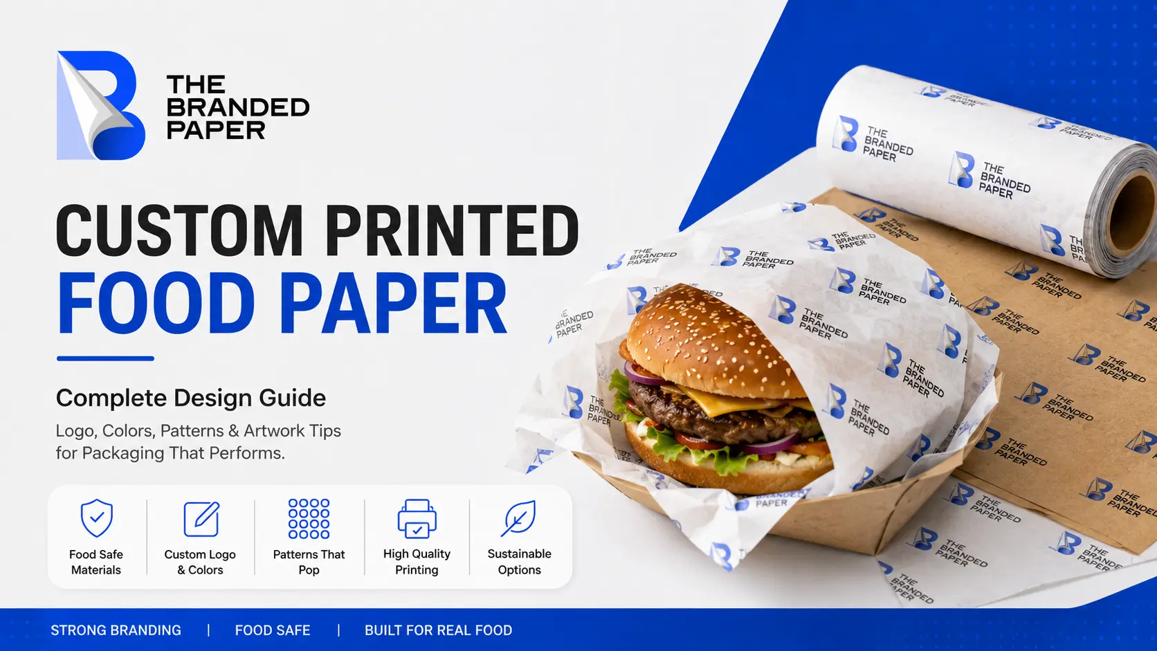
A repeating logo pattern gives the brand more chances to remain visible after folding.
Instead of printing one giant logo in the center, the same logo can repeat across the sheet at controlled intervals. Some marks will disappear inside the wrap, while others remain visible to the customer.
This works particularly well for restaurant packaging, food truck packaging, bakery wraps, deli sheets, and burger paper.
Leave Enough Space Between Logos
Filling every inch of paper with branding can make inexpensive packaging look busy.
White space helps each logo remain recognizable. It also keeps the food presentation from competing with the design.
A small logo repeated with comfortable spacing often creates a more polished result than dozens of tightly packed marks.
How Should You Choose Colors for Printed Food Paper?
Choose colors according to brand identity, paper color, print method, and contrast. The same artwork can appear different on bright white paper, translucent paper, coated paper, or natural brown kraft stock.
Your computer screen is also not a perfect print preview. Screen graphics are viewed with emitted light, while printed artwork depends on ink, paper, coating, and reflected light.
Use Contrast to Protect Readability
Dark artwork generally stands out clearly on white or light paper. Brown kraft stock can reduce the visibility of muted colors, so stronger contrast may be needed.
Before ordering a large run, check:
- Logo visibility from normal viewing distance
- Small text readability
- Color appearance on the actual paper
- Whether grease affects visual contrast
- Whether different brand colors remain easy to distinguish
A physical sample is especially useful when color consistency matters.
Do Not Add More Colors Just Because You Can
More colors do not automatically create stronger packaging.
For many branded food packaging ideas, one or two recognizable brand colors can create a cleaner result. A simple pattern also makes it easier for the food itself to remain the visual focus.
Use additional colors when they serve a clear purpose, such as identifying product ranges, flavors, locations, or seasonal campaigns.
How Do You Create a Good Repeating Pattern?
A good repeating pattern looks consistent from different angles and still works after the paper is cut or folded. Logo spacing, scale, direction, and repetition should be tested on the final sheet dimensions rather than designed on an endless digital canvas.
Three common approaches work well.
1. Straight Repeat
Logos appear in aligned rows and columns.
This creates a structured, clean appearance and can suit brands with a modern identity.
2. Offset Repeat
Each row shifts slightly from the row above it.
The pattern feels less rigid while still keeping the branding organized.
3. Rotated Repeat
Logos or icons appear at several angles.
This can work well for casual restaurants, food trucks, burger brands, cafés, and energetic quick-service concepts because customers can see branding regardless of how the food is wrapped.
Whichever style you use, avoid placing the marks so close together that the paper begins to look like wallpaper.
What Artwork Files Should You Send for Printing?
The best artwork file is clean, high quality, correctly sized, and easy for the printer to reproduce without rebuilding the logo. Vector artwork is usually preferable because it can be resized without the jagged edges that appear when low-resolution images are enlarged.
Useful files can include:
- Print-ready PDF
- EPS vector artwork
- High-resolution PNG when vector artwork is unavailable
- High-quality JPG or JPEG for suitable raster artwork
The Branded Paper’s current upload system accepts PDF, PNG, JPG, JPEG, and EPS files across several custom paper products.
Avoid sending screenshots, tiny website logos, compressed social media images, or artwork copied from messaging apps. These files may look acceptable on a phone but become visibly soft when printed.
Is Printed Paper Safe for Food?
Printed paper can be suitable for food packaging when the paper, coatings, inks, and other food-contact substances are appropriate for their intended use. Food safety cannot be determined from the artwork alone or from a general statement that an ink is “food safe.”
The FDA defines food-contact substances broadly enough to include packaging components and substances applied to packaging surfaces. For food-contact substances that are food additives, authorization applies to the intended use, and FDA safety review can consider potential migration into food.
FDA also states that the regulatory status of a food-contact material depends on the individual substances that make up the material and their conditions of use.
That makes several details important:
- Paper composition
- Food-contact coating
- Ink formulation
- Print location
- Food type
- Contact time
- Temperature
- Expected migration
FDA research has specifically examined components of printing inks used on the exterior of food packaging because some substances may migrate under certain intended uses.
For buyers, the practical question is not simply, “Is this printed paper safe?” Ask whether the complete printed packaging specification is suitable for the intended food-contact application.
What Does Food-Grade Paper Mean?
Food-grade paper refers to paper intended and suitable for food-contact applications under its specified conditions of use. It does not mean every food-grade sheet performs equally with oil, heat, moisture, or prolonged contact.
That distinction matters for the best packaging for hot food and the best packaging for takeout food. A paper may be suitable for wrapping a room-temperature pastry but unsuitable for baking. Another may manage burger grease well but not be intended for oven use.
Always match the paper specification to the application rather than choosing by appearance alone.
What About PFAS-Free Food Packaging?
PFAS are no longer being sold by manufacturers as grease-proofing agents for paper and paperboard food packaging in the U.S. market, according to the FDA. The agency announced completion of the voluntary market phase-out in February 2024.
That development is particularly relevant to grease-resistant food packaging because PFAS substances had been used to help paper resist grease, oil, and water.
Businesses requesting PFAS-free food packaging should still ask suppliers for clear information about the exact paper and coating being supplied rather than relying only on broad marketing language.
Is Eco-Friendly Food Wrapping Paper Always Recyclable or Compostable?
No. Eco-friendly food wrapping paper, recyclable food wrapping paper, compostable food wrapping paper, and biodegradable packaging are not interchangeable terms. Coatings, printing, food contamination, disposal conditions, and local collection systems can all affect what happens after use.
Environmental claims should therefore be specific.
The FTC’s Green Guides state that marketers need substantiation for environmental claims and may need to qualify recyclable or compostable claims depending on actual disposal conditions and facility availability.
Instead of putting a vague statement such as “100% green” into the artwork, use a claim your business can support.
For example, only state that packaging is compostable, recyclable, made with recycled content, or free from a particular substance when the relevant material specification or documentation supports that statement.
Design for Takeout and Delivery, Not Just the Counter
Food packaging for delivery faces more handling than packaging used for immediate dine-in service. The wrap may sit inside a box or bag, encounter steam and grease, move during transport, and reach the customer several minutes after preparation.
That changes the design priorities.
For delivery packaging:
- Keep important branding away from areas most likely to become heavily greased.
- Make the logo large enough to recognize without covering the whole sheet.
- Avoid tiny promotional text.
- Test the wrap around the actual menu item.
- Check how the paper looks after realistic holding time.
- Make sure employees can identify the correct side and wrap quickly.
Strong restaurant packaging ideas improve operations as well as appearance. If employees have to rotate every sheet carefully to make the logo face forward, the design is creating unnecessary work.
Common Custom Food Paper Design Mistakes
Most print problems can be reduced by testing the design as packaging rather than treating it like a poster.
Watch for these common mistakes:
- Making the logo too large
The mark disappears once the sheet is folded around food. - Using low-resolution artwork
Small web graphics can print with blurry or jagged edges. - Ignoring the paper color
Colors that look strong on white stock may appear muted on kraft paper. - Adding too much information
Addresses, slogans, social handles, QR codes, icons, and long messages can quickly create visual clutter. - Choosing paper based only on appearance
Grease, heat, moisture, and wrapping speed matter more than a perfect digital mockup. - Skipping a physical test
A design should be checked around the actual burger, sandwich, pastry, or other product whenever possible. - Making unsupported environmental claims
“Recyclable,” “compostable,” and similar terms should be supported by the packaging specification and appropriate evidence.
A Simple Artwork Checklist Before Ordering
Before approving custom printed food paper, confirm that the design works in real food service conditions.
- Use the correct paper for the food.
- Confirm the intended food-contact application.
- Supply clean, high-quality artwork.
- Check logo scale and clear space.
- Test repeating pattern spacing.
- Confirm color contrast on the actual paper.
- Keep essential artwork away from awkward folds where possible.
- Verify ink, coating, and material suitability with the supplier.
- Review environmental claims before printing them.
- Check the final proof carefully.
- Test a physical sample when available.
- Make sure staff can wrap food quickly with the finished layout.
Turn Everyday Packaging Into a Recognizable Brand Touchpoint
Custom printed food paper does not need complicated artwork to make an impression. A clear logo, controlled color palette, practical repeat pattern, suitable food-contact paper, and thoughtful print placement can turn an ordinary wrapper into consistent branded packaging.
The strongest design is the one that still works during a lunch rush. It wraps quickly, handles the food properly, keeps the branding visible, and arrives looking intentional.
The Branded Paper supplies custom food wrapping options for restaurants, cafés, bakeries, delis, food trucks, and food brands across the United States. Businesses considering their next packaging design can compare Custom wax paper, deli paper, parchment, and other materials before choosing the format that fits their food and artwork.
Frequently Asked Questions
1. How many colors should I use on custom printed food paper?
One or two strong brand colors are enough for many designs. Additional colors can work when they serve a clear branding purpose, but simple artwork is often easier to recognize once the paper is folded around food.
2. Should my logo be large or repeated across the paper?
A repeating logo is often more practical for wrapping paper. It increases the chance that branding remains visible after folding, while one oversized central logo can become hidden underneath the food.
3. Can I print directly on paper that touches food?
The complete material and print specification must be suitable for its intended food-contact use. The paper, ink, coatings, temperature, food type, and expected contact conditions should all be considered.
4. What is the best artwork format for printed food paper?
A print-ready PDF or EPS vector file is usually a strong choice because clean vector artwork can scale without losing sharpness. High-resolution PNG or JPEG files may also work when prepared correctly.
5. Can the same design be printed on kraft and white food paper?
Yes, but the colors may not look identical. Natural kraft stock changes the background color and can reduce contrast, so artwork should be reviewed specifically for each paper.
6. Should restaurants order samples before bulk printing?
A physical sample is useful when logo size, brand colors, grease performance, folding, or paper feel are important. Testing the paper with the actual menu item can reveal problems that are difficult to see in a flat digital proof.